If an album is a story, its cover is the introduction. It sets the tone – unless you exclusively listen to music on the radio or an iPod Shuffle. While art may not make or break an album, it can certainly change the way we experience it. From covers good enough to print on merch to the ones we pretend don't exist, most of our faves have epic highs and lows. And, as always, NBNtertainment contributors have strong opinions.
Ed Sheeran – Hope Cartwright
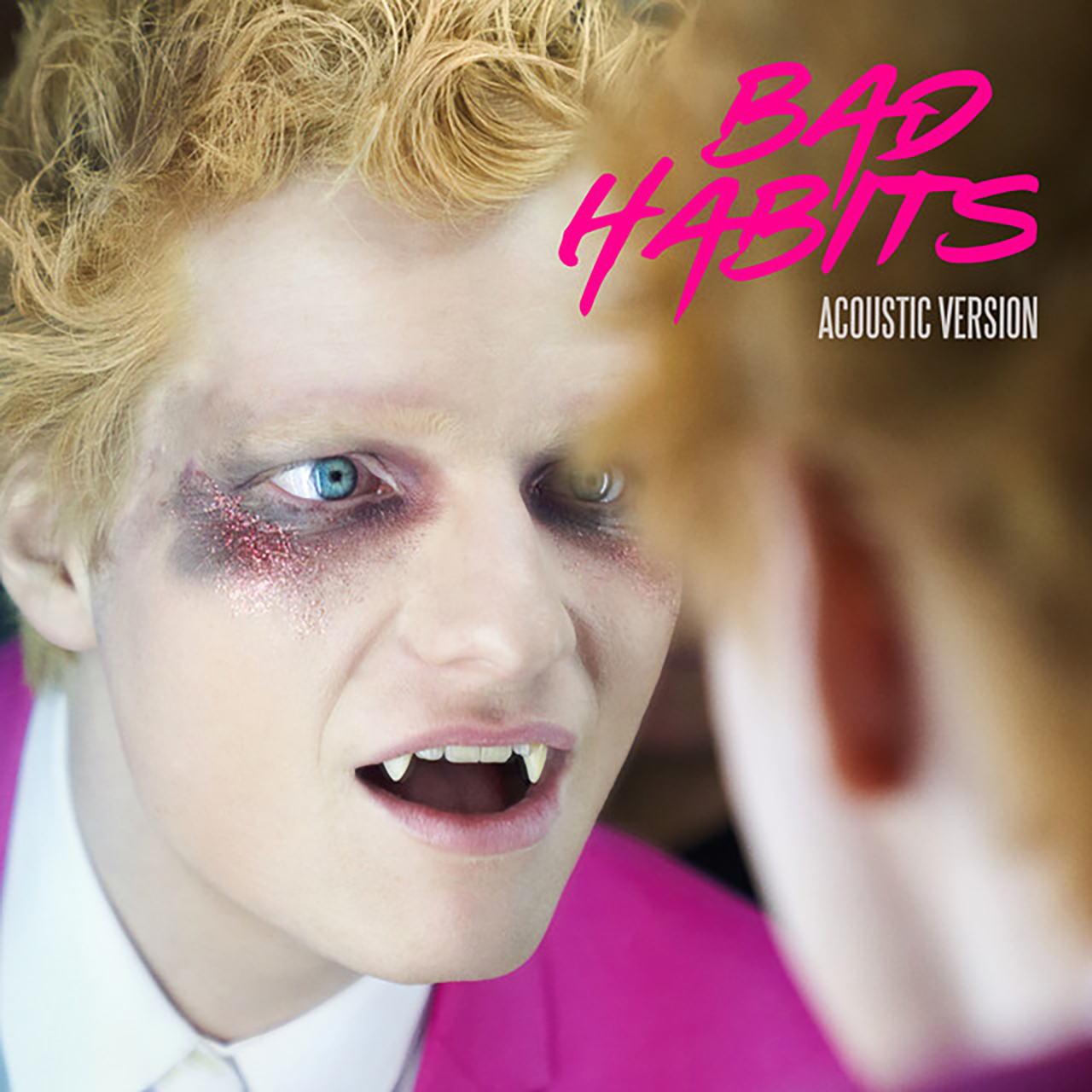
Worst: Bad Habits Acoustic Version, Honorable Mention: =
This is bad in so many obvious, awful ways. What business does Ed Sheeran have, as a ginger, being a vampire? What business does he have appropriating Kesha’s signature glitter around the eyes? This cover art is not only ugly, but also horrific, and not in the cool, sexy way I’m sure Sheeran’s team wanted it to be. Vampirism can be sexy if you’re Kirsten Stewart or Robert Pattinson, but Sheeran just is not on the same level. Things like this are why Sheerios are afraid to admit who they are. = gets an honorable mention because after seeing the cover, I genuinely believed it was a Christmas album for two months.
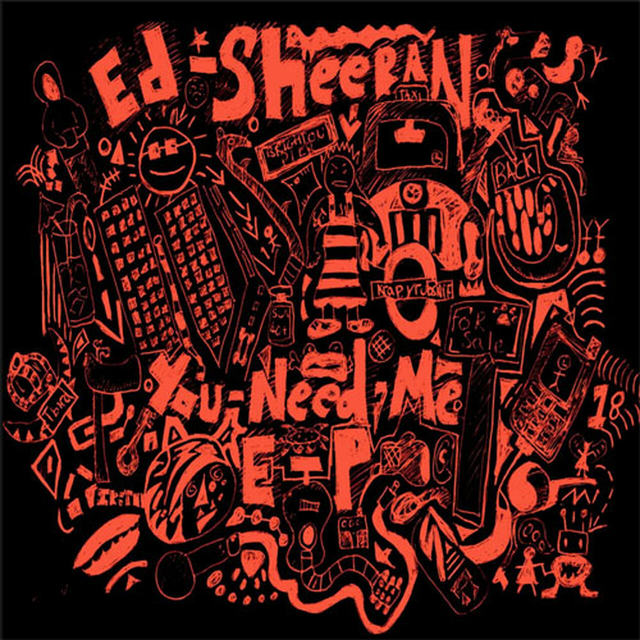
Best: You Need Me EP
Honestly, I’m not even sure that this is an example of truly good cover art. With Sheeran, there are not many decent options to choose from. This is Sheeran’s best cover art because it really captures his vibe – messy, a little juvenile and orange. Would I be embarrassed to wear a sweatshirt with this design on it? Yes, but less embarrassed than I would be to wear any of his other cover art designs.
Taylor Swift – Bailey Richards
Worst: evermore
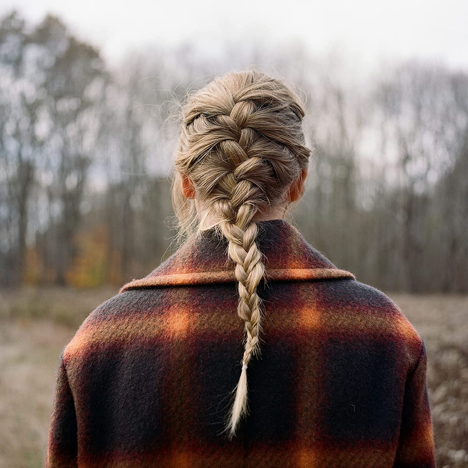
Taylor Swift’s absolutely massive discography combined with her tendency to milk the crap out of every one of her songs – what the hell is a cabin candlelight version? – make the task of picking her best and worst album art nearly impossible. For these reasons, I have decided to narrow my search to only her studio albums, of which evermore is the worst. While it’s one of my favorite Swift albums, evermore’s cover art doesn’t do it any justice, and I refuse to sit back and tolerate it. Whereas its sister album folklore’s black and white coloring was an effective stylistic choice, evermore’s coloring is just dull. And out of all the photos she and her team undoubtedly had to choose from, they landed on her … back profile? While I definitely would’ve saved it to my "hairstyle" Pinterest board in middle school, it just doesn’t make for good cover art. evermore? More like ever-snore.
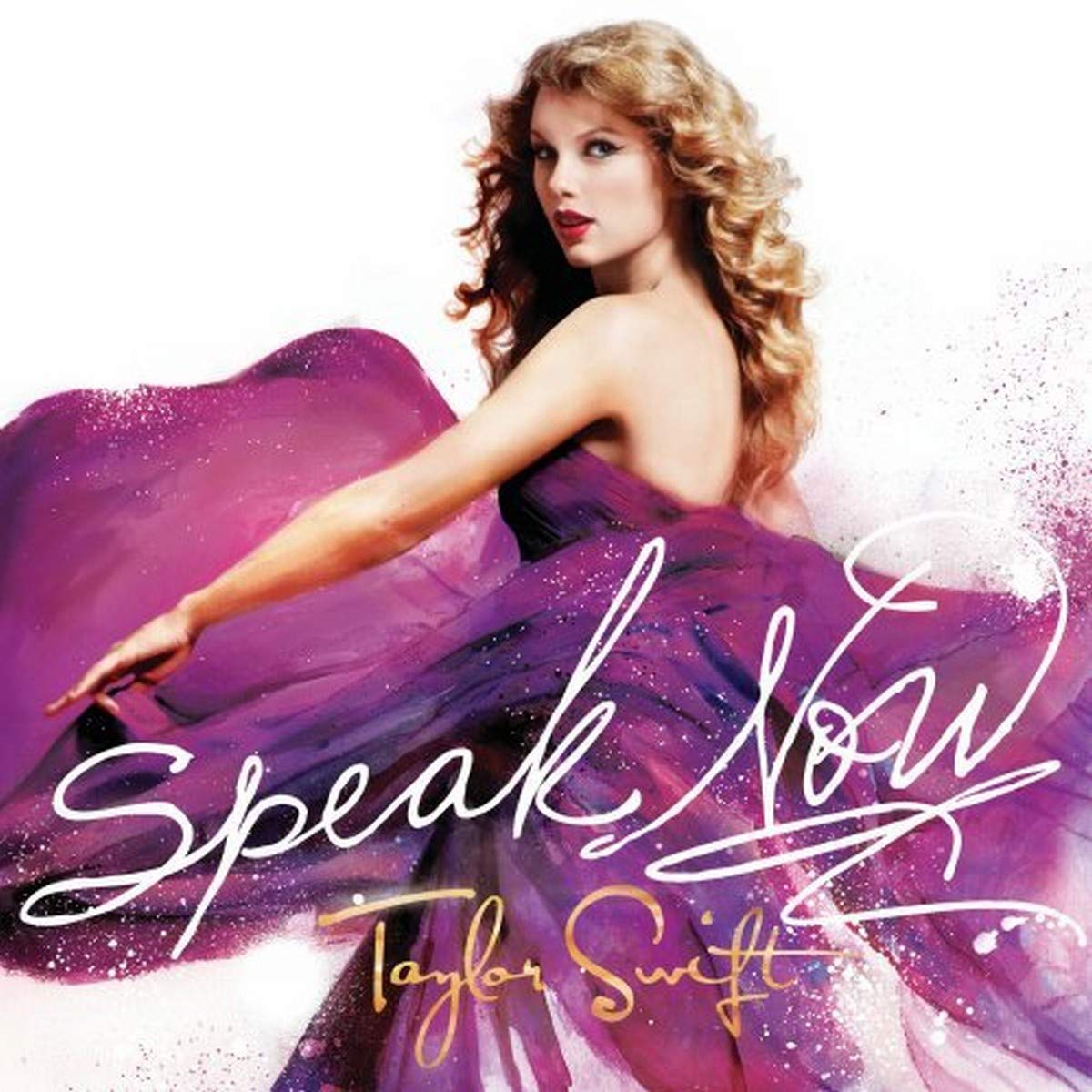
Best: Speak Now
While the art for Taylor Swift, the singer's first album, may seem like the obvious choice for worst cover, it was actually quite high on my list. Beyond the simple fact that it is pure, campy goodness, the album cover is truly the the blueprint; Taylor Swift walked so that Miley’s blue eye meme could run. Like evermore, folklore’s artwork suffers from being boring, and Lover and reputation’s covers look like the low quality photo edits I posted on Instagram in middle school. 1989 and Red are mid and both Taylor’s Versions were dangerously close to last place. And while Fearless is my favorite album of hers, Speak Now’s artwork reigns supreme. The cover is a painting, which I only recently discovered, and it perfectly encapsulates the album’s spirit. The paint splatters flying from Swift’s shimmering dress capture the essence of “Sparks Fly” to a T and her intense expression is exactly how I picture her singing “Haunted” and “Better Than Revenge.” The art is simultaneously inviting and sinister, elegant and badass. I can’t describe it better than by using Swift’s own (sung) words: enchanting.
Lana Del Rey – George Segress
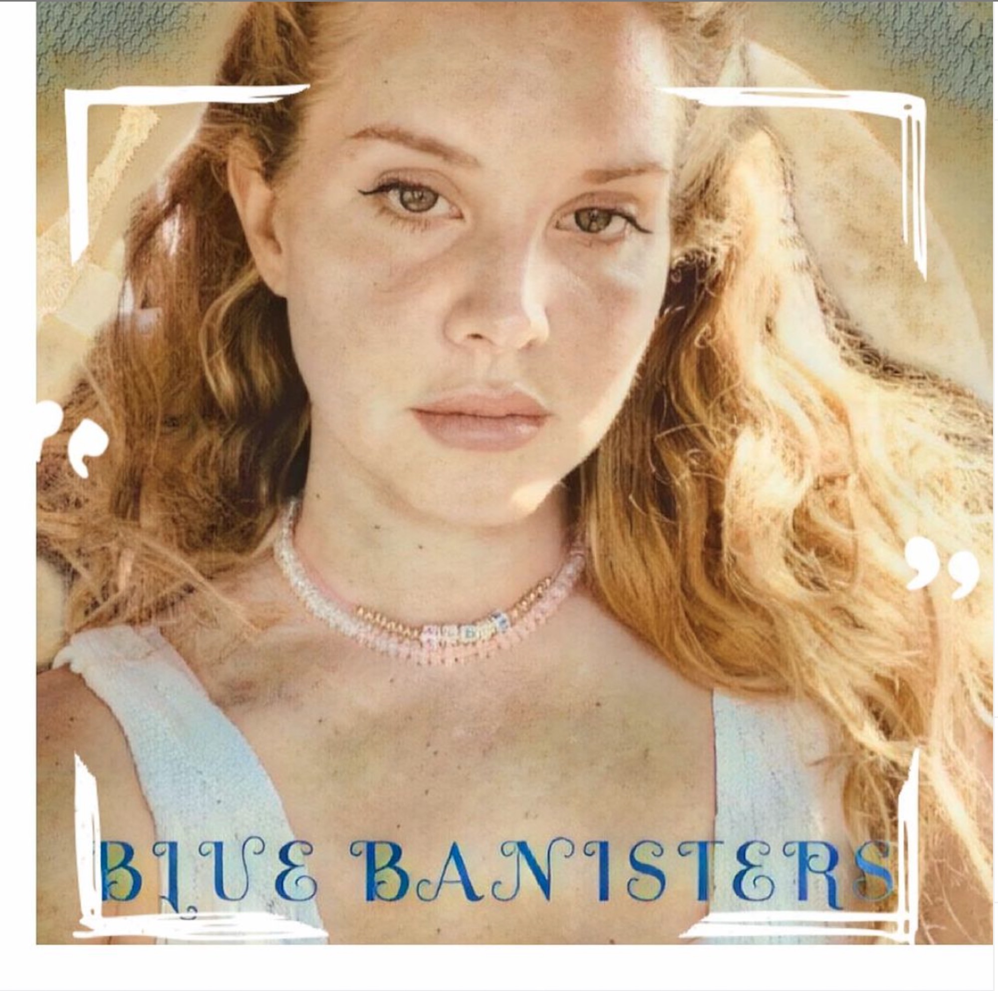
Worst: Blue Banisters (Original Cover)
After seeing the original “Blue Banisters” single art, Lana’s producer almost definitely had a panic attack. It looks like Lana found herself some PicsArt filters and a swirly font to create this masterpiece. Off-centered white corners incorrectly frame her face. The selfie itself isn't completely in focus, with her forehead looming ominously above our sightline. Two quotation marks randomly frame her neck. The cover seems to be fighting the very concept of cohesion.
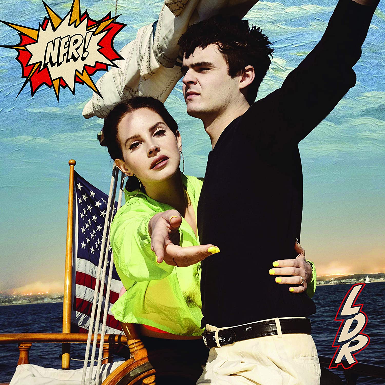
Best: Norman Fucking Rockwell!
Deciding Lana’s best album cover is difficult. There are a lot of contenders and the choice between Born to Die and Norman Fucking Rockwell! was difficult. Ultimately, Born to Die is less iconically Lana. I don’t really think any other artist could have made the NFR cover. The unique blend of painfully sincere camp, painted backgrounds and genuine beauty all make this her best and most iconic album cover.
Ariana Grande – Raquel Weinstein
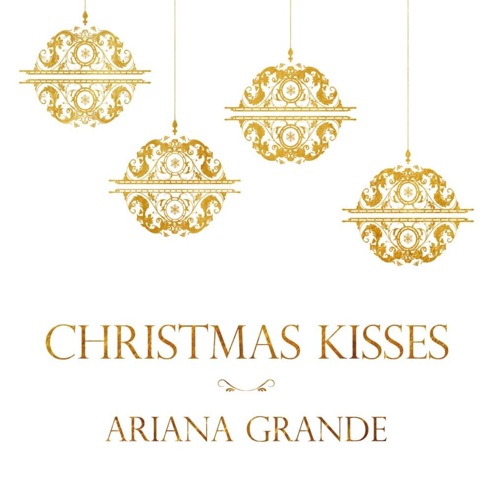
Worst: Christmas Kisses EP
This was the obvious pick for Grande’s worst cover. Sure, it’s an EP, so it isn’t meant to catch your eye, but the cover is reminiscent of a holiday card you would get from your grandmother. The proportions of the large ornaments with the text is odd, pulling our attention away from the star’s name at the bottom of the cover. The gold and white colors don't remind me of the holidays either. Unfortunately, it just does not grab my attention like the rest of her album artwork does.
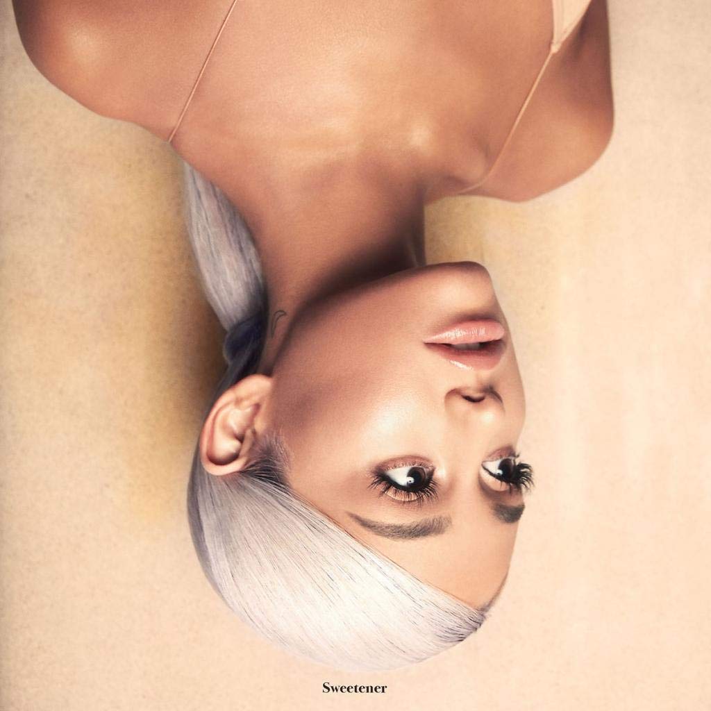
Best: Sweetener
Ariana has served us some stunning looks and poses on many of her album covers, but it’s the simplicity of Sweetener that makes it the best. I adore the low ponytail style. Slightly different from her iconic high ponytail, it keeps us on our toes. The use of the upside down image highlights Grande’s beauty and the lighter, orange and yellow tones of the picture make the cover glow, accurately reflecting the title of the album. And, of course, the finishing touch of the album’s title written in a small font on the bottom of the cover is the perfect finishing touch.
Charli XCX – Trent Brown
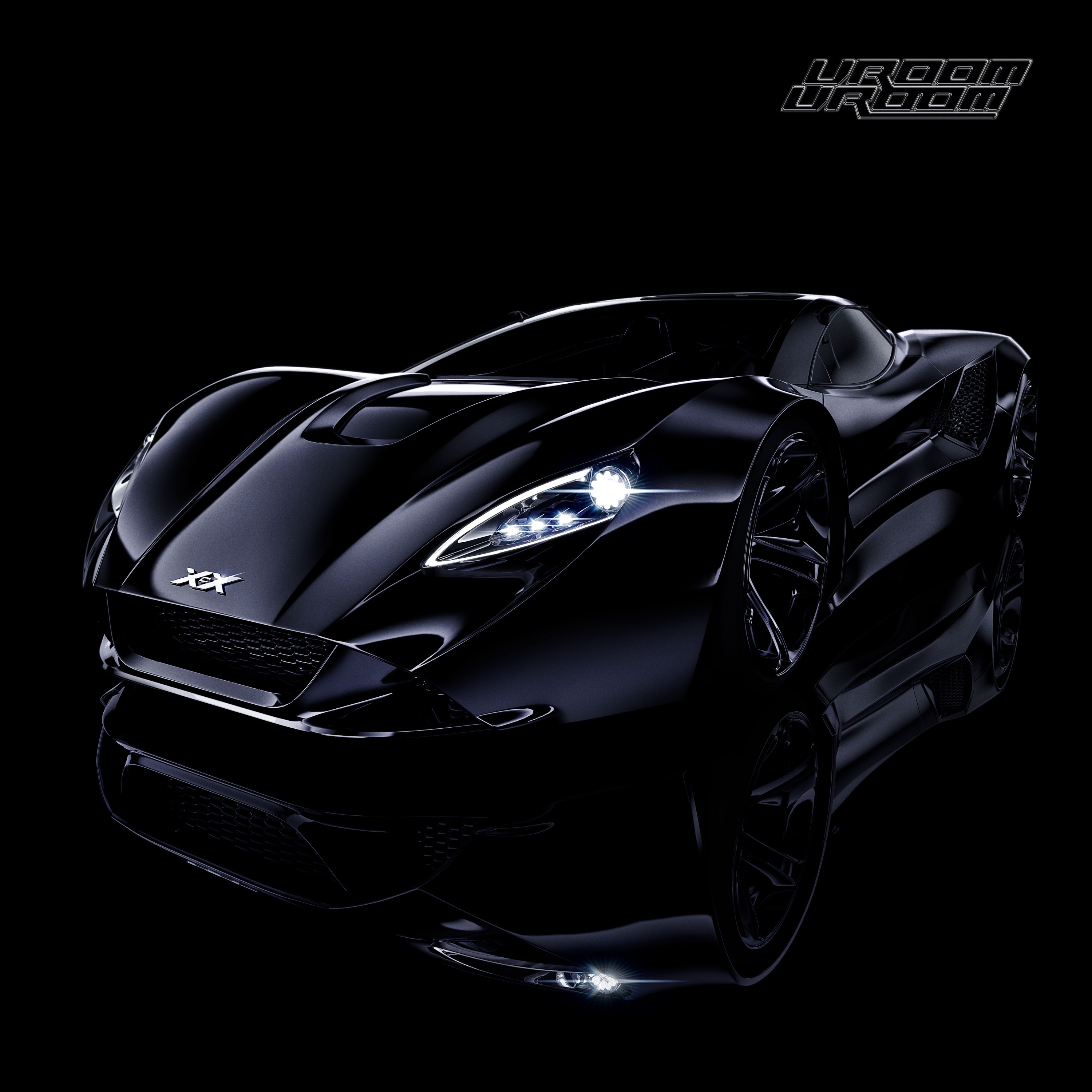
Worst: Vroom Vroom EP
Vroom Vroom launched a genre. Produced in its entirety by the late SOPHIE, the EP was experimental and innovative in all the best ways, making Charli XCX the mainstream face of hyperpop. I have a lot of love for this EP, which is why it pains me so much to admit that it has the worst cover art. Fellow Angels will recognize the car from the “Vroom Vroom” music video, but the reference doesn’t mean the cover actually, like, looks good. A black car on a black background with black text… give my eyes somewhere to rest, please. Thankfully, I can close them and let SOPHIE’s bombastic production envelop me so I don’t even need to look at Vroom Vroom’s relatively uninspired cover.
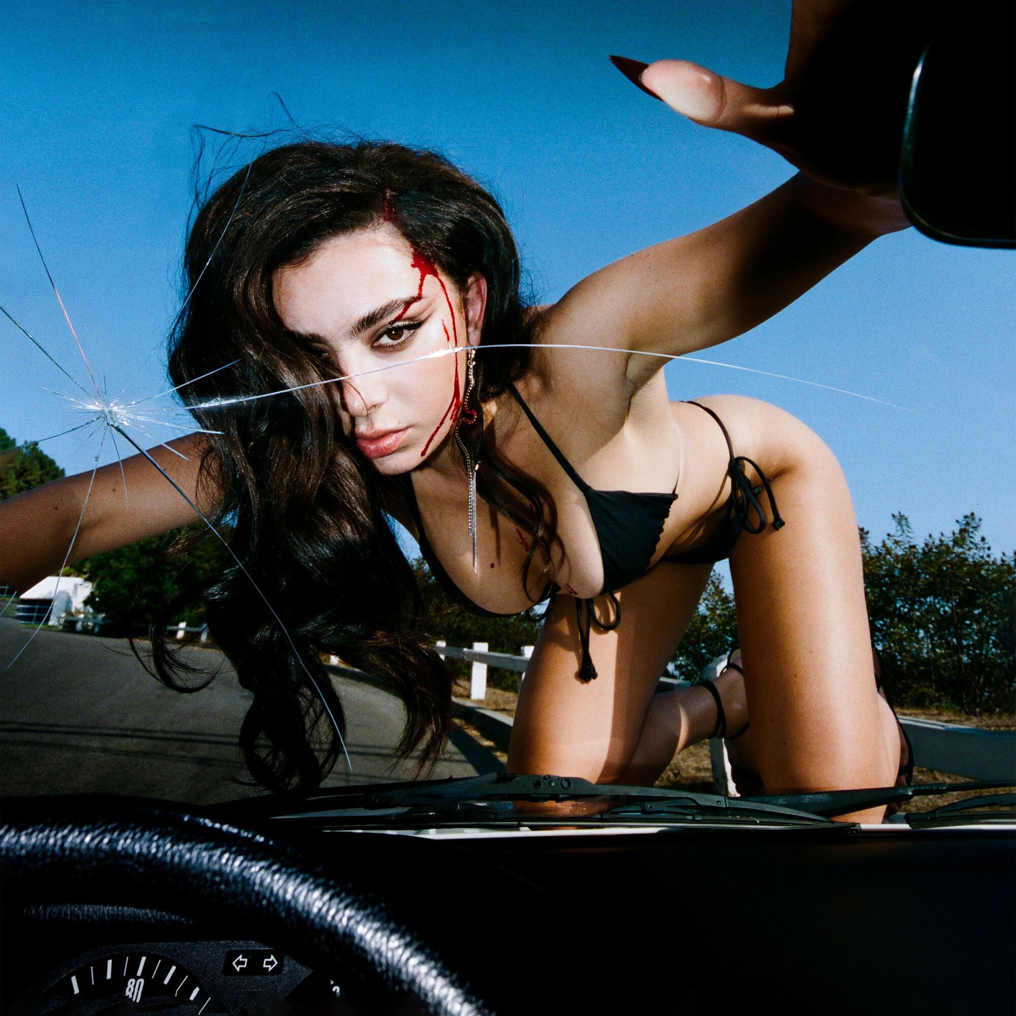
Best: CRASH
Charli’s upcoming fifth album CRASH may not be my favorite of hers sonically, at least from its singles, but it certainly has her most interesting cover. A bikini-clad Charli is positioned on the hood of a CRASHing car staring directly into the eyes of the driver, and the listener. If the cover of Vroom Vroom is a prototypical example of Charli’s obsession with cars (see: “Backseat,” “Porche,” “White Mercedes,” etc.), the cover of CRASH elevates that obsession to the highest power. I’m also a big fan of album covers without text, an itch that CRASH scratches. Out of all of Charli XCX’s album covers, CRASH is the most direct, innovative and interesting.